Zentracker

Helping counselors track their clients' meditation progress through ZenVR's virtual reality lessons.

What I Did
Surveys 
Users Interviews 
Personas
Wireframing
Prototyping
Interaction Design
Heuristic Evaluations
Usability Testing
Tools Used
Qualtrics
Figma
Miro
Sketch
Procreate
Team Members
Neharika Khandavalli
Aditi Bhatnagar
Suyash Junnarkar
Cole Anderson
My Role
Lead UX Researcher,
UX Designer
Timeline
Aug 2020 - Dec 2020
Academic Project

Background

As part of one of my core classes at Georgia Tech, ‘Research Methods for HCI’, students were divided into teams of 4 and tasked to work on a semester-long project to formulate an evidence-based design solution.

My team chose to work with ZenVR, a startup that creates educational meditation modules in virtual reality. ZenVR's mission is to teach people meditation through a virtual world.

In the current day and age, meditation is primarily taught in classes, monasteries, or dojos, and meditation training is inaccessible to those who do not have access to these facilities due to financial, geographical, or health constraints. ZenVR aims to bridge this gap by leveraging virtual reality to enable users to practice meditation within a digitally curated world.

Context into ZenVR's virtual reality lessons.

The Problem

Counselors can’t always check up on clients to record real-time data about the status of their mental health. They can only rely on visits, journals, and self-assessments on the day of the visit. This can often lead to inaccurate results since clients, especially students, might not be able to process and articulate the multitude of stimuli they experience everyday.

Currently targeting individual VR users, ZenVR came to us with hopes of expanding their business model into the mental health space. They want to offer their meditation lessons, along with VR headsets, to college campuses across the country. In order to do this, they first need to understand if and how counselors track their clients’ meditation progress.

That's where we come in!

Over the last few months, my team engaged in an in-depth research project to understand counselors' needs, attitudes, and preferences towards meditation and progress-tracking.

The Goal

How can we improve the way in which counselors track their clients' meditation progress?

The Process

Our Solution

A web-based tracking tool that enables counselors to track their clients' progress on ZenVR's meditation lessons through streamlining data visualization, providing custom journals, and a share progress feature.

My contribution: I led the team's recruitment efforts for surveys and user interviews, conducted 4 User Interviews, helped create storyboards, user journey maps, empathy maps, and user personas. I also designed wireframes of our initial concepts, and co-designed and prototyped the final prototype in Figma. I also contributed through visual design, graphic design, and UX writing, and helped design the remote, unmoderated usability study.

What I gained: Through this project, I learned that designing for a large user group can be difficult, and that different users of the same product may react differently to it. I learned that adapting ideas quickly based on resources and feasibility is imperative.

Our Approach

Research

First off, we aimed to understand our stakeholders, users and existing solutions. To holistically understand the problem space and our user needs, our team created a research plan that incorporated the following methods.

We decided to divide our research into two phases: a primary research phase where we understood the context of the problem through an in-depth literature review and competitive analysis followed by a secondary research phase where we distributed an initial survey to 400 participants and subsequently conducted 8 user interviews. We synthesized the collected data into an affinity map that helped us build personas, empathy maps, and design concepts.

Literature Review

We performed an in-depth literature review to learn about meditation and the role it plays in counseling. We looked at research that studied the effects of employing mindfulness techniques for therapy and studied the benefits of tracking client progress to improve individual care.

Competitive Analysis

We also looked at existing apps in the market, such as Tergar and Buddhify, to get a better understanding of the commercial work being done in the mindfulness space. These solutions mainly tracked the quantitative aspects of meditation with descriptive statistics. However, in order to provide meaningful insights to counselors, we decided that we need to delve deeper and look into more sophisticated data analysis methods.

Establishing the Problem Statement

Upon reviewing existing literature and solutions, we met with our industry partner to establish project requirements and discuss how they would align with our team goals. At this stage, we identified our target users and stakeholders, and came up with a list of central questions that would guide our research moving forward.

Given the central questions displayed above and an in-depth literature review on the role meditation plays in counseling, we arrived at the refined problem statement displayed below:

“ZenVR wants to define the relevant characteristics of client progress on their meditation modules. Identifying these characteristics will enable counselors to track clients’ meditation journey and incorporate key insights into future counseling plans.”

Surveys

We decided to start our data collection with surveys because we wanted to get a general understanding of the scope and extent to which counselors track client’s progress on meditation.

We sent out over 350 emails to counselors across the country, inviting them to participate in our survey. In total, we received ~30 responses, which was close to the expected 10% response rate.

Semi-Structured Interviews

Once we gathered an array of high-level quantitative and qualitative insights from our survey, we started to design our semi-structured interviews to gain more in-depth information about the habits, attitudes, and preferences of counselors regarding meditation tracking.
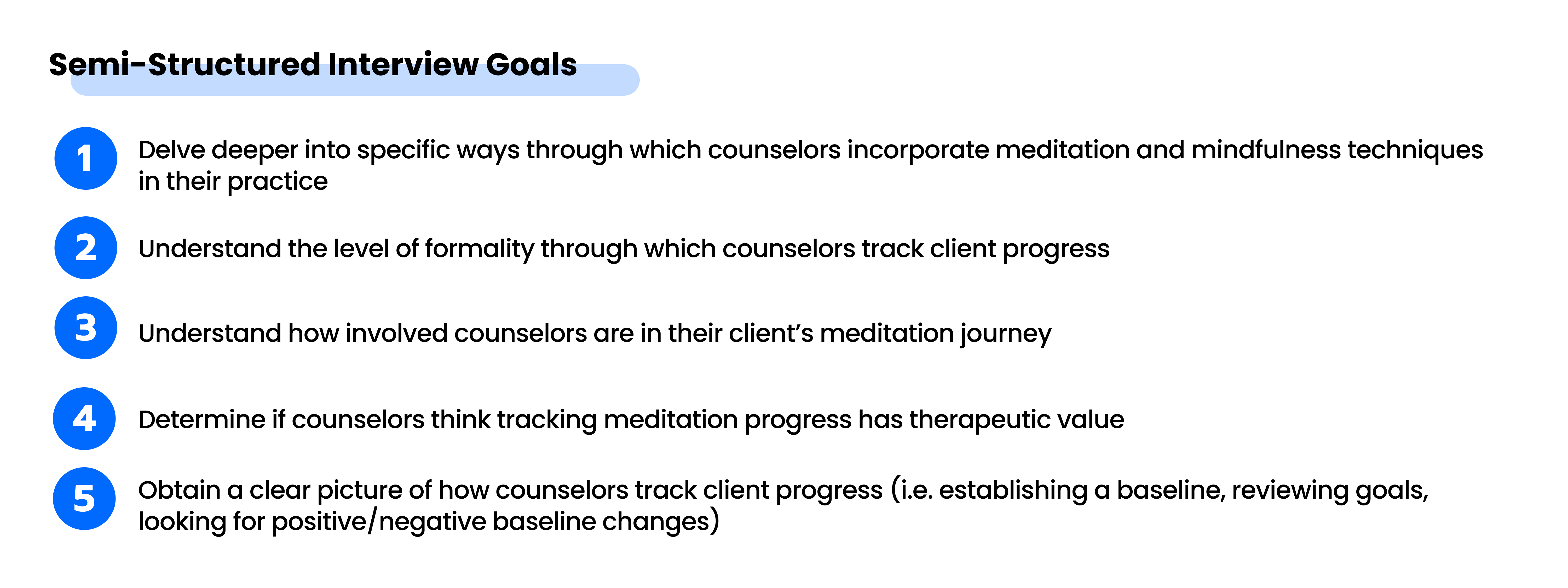
Initially, we only wanted to interview college counselors who specialize in mindfulness and meditation therapy. However, we broadened our scope to include any counselors or therapists that integrate meditation or mindfulness-based techniques into their practice.

In total, we conducted eight 60-minute semi-structured interviews with counselors.

In order to gather a set of rich and comprehensive data, the team decided to delve into questions that specifically focused on understanding the role of mindfulness and meditation in therapy. The final set of questions used to conduct our semi-structured interviews are listed below:

Mindmap of Final Interview Questions.

This was by far the most valuable research activity we conducted, since it gave us an in-depth understanding into the needs and preferences of counselors.

Analysis

Upon completing our interviews, we came together as a team to organize and analyze our findings through a series of interpretation sessions. We synthesized the collected data into an affinity map to help identify themes, form insights, and brainstorm design ideas to solve higher order problems. The following are some of the specific themes we looked for during out interpretation sessions.

After 14 long hours of transcribing ~500 notes and digitizing the affinity map.

We generated 60+ notes for each interview, yielding a total of ~500 notes for all eight interviews combined. While it was assuring to find patterns that supported our hypotheses, we also paid close attention to emerging ideas that challenged our assumptions. We specifically looked for contrasting opinions and approaches to progress tracking to identify key differences within the field.

Findings

Based on the affinity map, we generated the following insights by grouping similar notes under similar headings.

Storyboards, User Personas, and Empathy Maps

Using our acquired user needs and design implications, we developed storyboards, user personas, and empathy maps to tell a story from the data.

Storyboards

Based on our findings, we created two storyboards, the first focusing on how counselors take patient notes and use them to track their progress and the second focusing on how counselors incorporate meditation and mindfulness techniques into their practice and how they track this progress.

Personas

We then created three personas that captured the essence of our users and their characteristics. We also formed empathy maps and journey maps to understand their needs and frustrations.

User Personas (left to right): Marlene, Robert, and Viola
Empathy Maps
Empathy Maps (left to right): Marlene and Viola
Journey Map
Journey Map for Marlene

Design

Sketched Concepts

Given our research findings, we came up with two preliminary sketched concepts that tackled the problem space. Our goal with these sketches was to find distinct ways to visualize the most important features and functions of our application.

Using the analyzed findings from the survey and interviews, We started by writing down the primary needs of counselors in terms of tracking clients’ meditation progress. Our team of four then took turns sketching preliminary designs, incorporating features that we deemed necessary for each persona.


Sketched Concept 1: Inspired by Marlene

This design was sketched for User Persona 1, Marlene, who wants to be able to:

  • Track client progress by going through her notes from each session
  • Know if clients are completing their assigned homework
  • Learn how clients feel before and after performing meditation modules

Sketched Concept 2: Inspired by Viola

This design was sketched for User Persona 3, Viola, whose goals are as follows:

  • Wants a way to send out a survey for tracking emotions in a remote setting
  • Needs to know the number of times the client does a prescribed task each week
  • Wants to compare her notes before the session and right after the session
  • Wants to know the emotional state of her clients throughout the week

Once we sketched out our designs, we conducted three 45-minute feedback sessions with our preliminary design concepts. Each session was conducted in the format of a semi-structured interview where we utilized a mix of open-ended questions and ratings.

Feedback sessions were empirically developed to offer users the opportunity to candidly share opinions, attitudes, and preferences towards our two designs. Our sessions were built based on feedback goals and known implications, then carried out by a facilitator and notetaker over BlueJeans, a video-conferencing tool used at Georgia Tech.

Counselors did not show a particular preference for one sketched concept over another since both designs had overlapping features that were important. Overall, counselors expressed interest in the following features:

Since these features were deemed as most useful by all counselors, we decided to combine and incorporate them into the first iteration of our wireframes.

Wireframes

Upon completing the sketched concept feedback sessions, we made our initial wireframes in Figma taking into account the design recommendations listed above. Our goal with the wireframes was to concretize the function of each feature and incorporate any new features that counselors wanted.

Since our application caters to specialized professionals with technical expertise, we were limited in the assumptions we could make about how our prototype would be received. Hence, we spoke to several counselors and went through two rounds of iterations on the wireframes to eliminate any gut-feeling decisions about the features and functionality of our application. By engaging in an iterative design process and conducting multiple feedback sessions, we were able to cultivate a concrete conceptualization for our prototype.

We used a similar iterative process as the Sketches feedback sessions to conduct Wireframe feedback sessions.

Wireframes Round 1

Features and corresponding explanations are in blue. User feedback is in red.

Wireframes Round 2 & 3

High-Fidelity Screens

We did a 3-day design sprint to convert our wireframes into an interactive, high-fidelity prototype. We used a clean interface with high color contrast because the application is catered towards trained professionals who appreciate simple aesthetics and clean readable fonts. We collaborated as a team, iterating through many design ideas to craft our final product.

Evaluation

To evaluate the efficacy of our prototype, my team conducted 3 heuristic evaluations with UX experts and 5 remote think-aloud task-based usability studies spanning across counselors who already use meditation in their practice and those who wanted to incorporate it more moving forward. 

Here's a brief overview of process:

Heuristic Evaluations

Through the heuristic evaluation, we wanted to identify any usability problems that prevent users from accomplishing key tasks. We also wanted to make sure that the application was high on learnability and predictability. Further, we wanted to ensure that the terms used in the application were simple and self-explanatory and that the user flow was as expected.

We conducted the first heuristic evaluation with an HCI professor at Georgia Tech. At the end of the evaluation, the professor urged us to create our own system-specific heuristics so that we would be able to better fulfill our evaluation goals.

Revising our Heuristic Evaluation Strategy

The evaluator’s advice resonated with the team, so we revisited our evaluation goals and formulated our revised heuristics based on key tasks and key features within the application.

We created these new heuristics per page based on specific questions that would best fulfill our evaluation goals (displayed right).

We then conducted two heuristic evaluations with the revised strategy. 

Usability Testing

Upon completing and analyzing the feedback from the heuristic evaluations, we iterated on our prototype and then conducted 5 remote think-aloud task-based usability tests with counselors. Our main goal with the usability tests was to assess how well users can complete key tasks within the application.

Overall, we gathered a mostly positive response to the prototype. Participants were able to perform the benchmark tasks with ease, and the semi-structured interviews allowed us to obtain qualitative data about user's thoughts while using the app. Here are a few highlights from the findings:

Our mean SUS score was 87.5 out of 100. During the interview, we asked participants to explain how they feel about the interface. The top 5 words that we noted were: Convenient, Innovative, Clean, Effective, and Comprehensive.

Many users have told us that they hope our design converts into a business solution that they hope to use with their clients in the future!

Design Recommendations

We gathered a lot of helpful feedback from our heuristic evaluations and usability tests. Based on this, we formulated the following design recommendations.

  • Remove global navigation from Client Details and have it visible only when a user clicks on a specific client’s profile.
  • Specify name of the client next to the heading on each page.
  • Identify and fix verbiage inconsistencies across the application.
  • The ​Enter a Question ​feature should be redesigned to only include one button underneath. “Add” button can be removed entirely and users should be able to add a question simply pressing “enter” after writing the question.
  • Remove the “Do not assign a tracker” button and "back" button on the data visualization popup and add a smaller cancel button on the top right corner.
  • Share progress should be redesigned in the format of a page instead of a pop-up to maintain consistency in terms of interaction design.
  • Client Goals should be redesigned such that short-term goals open up on a separate screen once the corresponding long-term goals is clicked on in the dashboard.
  • Create a formal onboarding process that walks users through the various terminology and features within the application.
  • Make action buttons and text within action buttons larger. In addition, make the buttons a bolder color with a higher contrast ratio between the text within the button and the background color of the button.

Reflection

This was my first project since I began my Master's in HCI at Georgia Tech. It was a great learning experience working with a diverse team of individuals, all of whom come from varied backgrounds and complement each other's unique skillsets. Having the opportunity to work with an industry partner made the experience a lot more realistic than a traditional ‘no-constraints’ course project.

Over the course of the project, I learned how to:

Lessons Learned

Research, research, and more research: This project involved over 4 different research methods to better understand our users. Taking the time to design our research methods to figure out our users’ needs helped us make sharp design decisions with confidence.

When in doubt, go back to insights: There were several times during the design process that we had opposing ideas as a team. What helped us move in the right direction was going back to the affinity mapping insights and referring to the user quotes from the interviews.

Communicate and collaborate openly: As a team of four, we hybridized our efforts to approach our problem space with collaborative research and design solutions. Each step of our process involved the input, iteration, and thought of all team members, and we met frequently over Slack, Microsoft Teams, and in person to process and assess the efficacy of our research methods, design requirements, evaluation plans, and final decisions. Each team member had a valuable role to play in the success of the project, and fluidly ebbed between responsibilities in order to fill in any presented gaps.

Test with enough users: While evaluating our designs throughout the project, we always pushed to get a varied sample for testing. This helped in making sure that our solution wasn't being directed by a small unrepresentative population and could be generalized for a scalable audience.

Future Directions

  1. At the end of the semester, we presented our solution to our industry partner, ZenVR. They were interested in making our designs come alive by developing a cross-platform web application.
  2. Our proposed solution involves a counselor-facing platform that enables counselors to track their clients meditation progress on ZenVR's lessons. We plan on extending the platform to include a client-facing application that allows them to keep track of assigned modules and interact with counselors easily over a period of time.